COLIN SOPER
“This color is a bully”, my Intro To Painting professor warned me. I had spent half an hour trying to mix up a green that was deep in color but still vibrant and cool, but all I had to show for it was a large pile of muddy, not-quite-green-anymore goop. He went to his paint box and pulled out a large, well-loved tube of dark green paint, a color that wasn’t on our list of required materials. “I think this is what you need,” he said as he handed it to me with a knowing smirk on his face, like an older sibling watching you take your first hit. And now, 10 years later, I’m still addicted to the green stuff… Phthalo green.
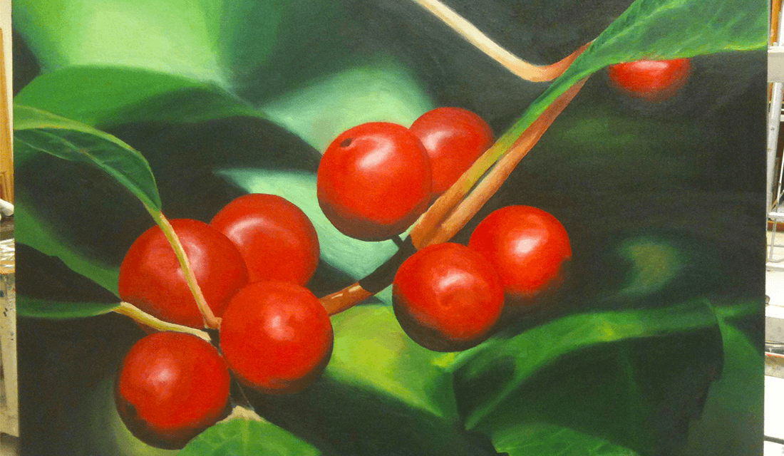
The painting that lead me to Phthalo green (Oil on canvas, 2010)
Equally addicting is its close cousin, Phthalo blue. He was right. They are bullies. Even a tiny spot added to a paint mixture will entirely transform it. I never used to think of cool shades as assertive. It’s always the warm colors that demand our attention. The impact of bright reds is built in to our psychology. Linguists will tell you that, after “light” and “dark,” red is the first color we humans have come up with a name for, over and over again, in every language. The theory goes that this all ties back to a need to identify danger. Or sex, of course. Blues, however, are, just, well… blue. A young, depressed Picasso made a whole thing out of it, even before he’d had a chance to cultivate decades of misogyny and abusive behavior to weigh on his conscience. Blue is subdued, down, depressed. If not sad, then at least mellow. Cool as a cucumber (which is really green, but I digress).
The specifics of color choice are then liberated to be used for the conveyance of emotion, or for dramatic effect, or sometimes just because I enjoy the way two colors look together.
The surprising pattern behind color names around the world | Source: © Vox/YouTube
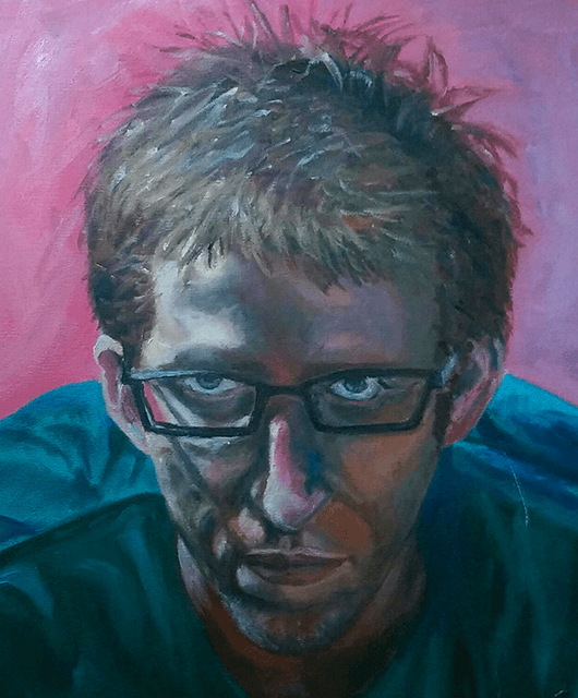
First time I was ever happy with my application of skin tones. Lots of blues and greens, but still being reserved with it. Self-portrait (Oil on canvas, 2011)
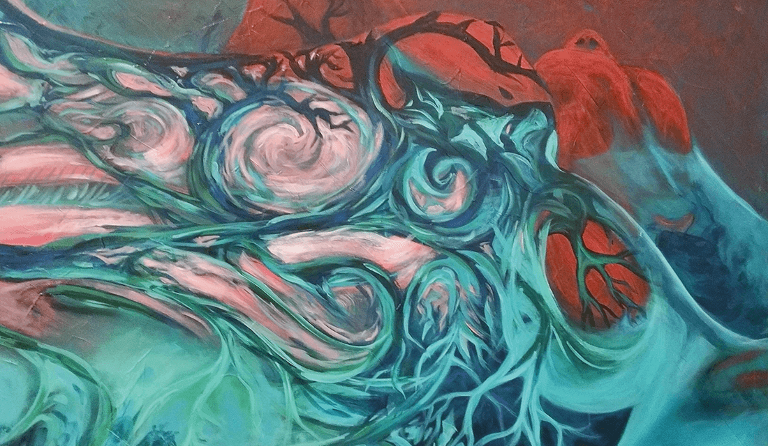
But the Pthalos have a way of making themselves proudly known, especially when you add a little titanium white to help them strut. They’re versatile, though, depending on who they’re playing with. They can be brooding as an ocean trench, or pop out in a neon bright enough to make the club kids drool. They combine together to make a deep, resonant teal, or mix with warmer colors to make neutral tones that have just a twinkle of something more confident underneath. This spunk and versatility is why they’ve made their way into pretty much every painting I’ve done since my professor introduced me to these so-called-bullies. They even show up in skin tones. Especially in the skin tones.
One of the most fascinating struggles in learning how to paint faces was deconstructing what “skin color” really is, and isn’t. Turns out the monosyllabic skin color constructs of white/brown/black/et cetera break down real quick once you start to look close (I’ll spare the reader from suffering through me grinding on the obvious social metaphor there). I like to use a mix of cadmium yellow, alizarin crimson, titanium white, burnt & raw umber, and, of course, pthalo blue/green. The proportions vary wildly between and even within paintings. Even when going for realism, I need the rainbow to make skin colors. The first time I tried to incorporate green into a skin tone, I had no idea what the fuck I was doing. But I soon learned that without those cooler colors, it just looks a sickly, jaundiced yellow. Or a xenophobic orange.
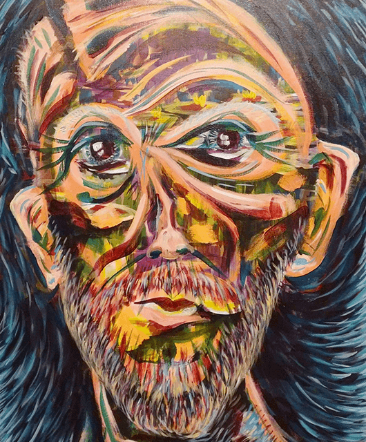
Most recent self-portrait. We’re off the deep end now (Acrylic on canvas, 2018)
Knowing all those colors were always hidden in there to begin with made it that much easier to step off the deep end with them and let them shine. Wide swaths of purple-blue for shadows under the neck. A brilliant pale green highlight on the forehead. Dark crimson under the eyes, tangling with the browns and blues to show the delicate creases and folds that envelop the windows to the soul. I’ve even begun to Photoshop my reference photos into oblivion (when I bother to use them), abandoning any pretense of natural skin tones.
Once liberated from the confines of skin-colored skin, it became a delight to discover what else the constituent hues can do. Pushing the juxtaposition of cool vs. warm, or dark vs. light, is more than enough to define the forms I need. The specifics of color choice are then liberated to be used for the conveyance of emotion, or for dramatic effect, or sometimes just because I enjoy the way two colors look together. A lot of the time it’s because that’s what I had mixed up from a previous painting, and I’m nothing if not thrifty… or lazy.
Lots of skin, no skin tones (Acrylic on canvas, 2018)
If nothing else, the practice of art has taught me to appreciate the beauty of form in its own right. The scientist in me, however, is more intrigued by how that form imbues function, and how the two in truth cannot be isolated, even in art. The psychological weight that red commands in our collective conscious likely stems from the color of blood, at least in part. That color, in turn, is a product of the heme molecules in our red blood cells. Heme has an intricate porphyrin ring structure that is very good at shuttling oxygen around. Incidentally, the conjugated ring structures that make these porphyrins so stable also tend to make them very brightly colored. Phthalocyanine pigments, it turns out, are a variation of that same porphyrin structure. And at least in one artist’s mind, they carry just as much emotional impact, the lifeblood of my art.
All works and photos courtesy of the author.